
Steam



Zhiuwu


UX Design Intern
(1)

Apex Legends
UX Design
(2)

Mech Believe MEGA BRAWL!!

All Good Things
UI/UX
(5)

The Wind and the Wisp

STARWEAVE

Social Moth

Awkward Turtle

Bounty Heart
Concept Art
(4)
The Wind and the Wisp
STARWEAVE

Drenched
Social Moth

STARWEAVE
USC Games
August 2022- September 2023
Unity Engine
PC & Mac


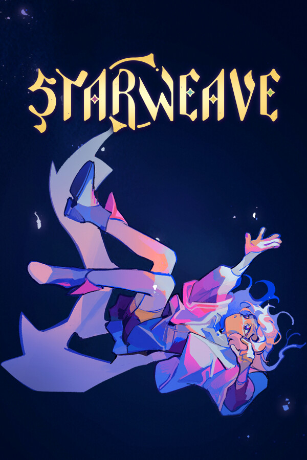
Set out on your destined quest in this narrative-focused turn-based tactics game. Issue commands, light Beacons, exercise compassion. Take heed, for your roles shall constrict, and your tale was always meant to be bittersweet. Who will the stars dictate we be?
Team
Me
UI/UX, Concept Artist
Rachel Geng
Director
Allena Zhu
Art Lead
Nicky Olsen
Usability Lead
Sammy Chuang
Engineering Lead
60+ members, 8 teams
Tools
Figma
Clip Studio Paint
Unity Engine
Github
Skills
UI Design
UI Wireframes
Trailer
Released March 9th, 2026
A squad rpg that utilizes tactical gameplay and allegorical narrative design to the end of encouraging players to exercise compassion when a cast of hurting teens lash out and even revolt against the player’s very tactical commands in a dire and oppressive situation.
The Task
Extra Polish
STARWEAVE already had an established aesthetic, and theme with sketched wireframes to follow. So my main role was polishing the existing UI, while also doing layout tweaks as game systems change.
Problem(s)
- Lack of standard color palette causing the UI to not look cohesive scene to scene.
- UI assets felt flat, were unfinished, or did not fit the game’s original design/style guide.
- Placeholder party and settings scene that were outdated and did not reflect the most recent design of the game.
Task(s)
- Establish standardized color palette for both characters and UI.
- Visual updates for most UI assets to be align with UI style guide.
- Create wireframes/mockups to revision the flow of the party and settings, better reflecting current game designs.


References
Physicality & Ethereal
We used League of Legends as our main reference for how we wanted the UI to look and feel. League of Legends has a sense of physicality with their UI that we wanted to communicate with our UI as well.
- HUD elements stacked upon each other using bevels and drop shadows.
- Flat gradients with texture to break up the colours.
- Use ethereal. painterly patterns to match a fantasy, otherworldly feel.


iterations
Sketches Into Midfis
There were two screens that still needed to be iterated on further: party and individual member screen. With the help of sketches given to me, I turned them into midfis.
With the individual member screen, I essentially played Tetris as there's a lot of information that needed to be squished into a smaller container. Because STARWEAVE has more focus on aesthetic I wanted to make sure to strike a good balance between looking good and still being readable.

By Rachel Geng


design system
Style Guide
The narrative of STARWEAVE places a heavy importance on the characters. They each have specific hex codes connected to them and I used those hex codes to help create their unique palettes for their combat skill icons. I wanted to make sure the contrast between each shade was enough to create enough depth especially because the icons are relatively small.
For the general UI, I wanted to establish the metal colour palettes. I wanted the metal to act almost like a picture frame that doesn't take away from the content itself but does lead the players eye to the right places. While putting together this palette I also needed to make sure nothing will get lost as the game itself it quite colourful and have varying saturation.

iterations
Hifis
On the road of overhauling and creating UI, there were certain aspects that changed and certain screens needed to be adjusted. A lot of it were tweaks to better show off information especially aligning UI elements that utilizes the space much better.


Polish
Final
There were two screens that still needed to be iterated on further: party and individual member screen. With the help of sketches given to me, I turned them into midfis.
With the individual member screen, I essentially played Tetris as there's a lot of information that needed to be squished into a smaller container. Because STARWEAVE has more focus on aesthetic I wanted to make sure to strike a good balance between looking good and still being readable.

Combat Skill Icons


The End
Ending Thoughts
This project is my first time diving very heavily into UI art specifically. I did not have much to do with the UX design side as most things were already established and it was something not heavily focused on during my time in the team. It is definitely a humbling experience. I really enjoyed going out of my comfort zone, going into a rendering style that I wasn't used to. But with the help of my art lead and director I perservered to achieve a style that satisfied all of us.
The more challenging aspect was being unfamiliar with UI art in general. While I did have the basic understanding of UI art I wasn't sure if I could pull off the quality. Especially when the more painterly style was not something I had a lot of experience with. However, with the style guides and referencing other UI done by the previous artists I was able to communicate the physicality of the UI.
While this experience was more UI art heavy, I still appreciated what I gained from diving into it. I got the taste of UI/UX that is fueling me to do even more especially with UX design. It also made me realize that with game development out comes moments where sacrificing an ideal for a better user experience is a decision need making. It's always tough wanting to have something look right, but realizing down the road how much it impacts the player. Even the smaller things like placement or colours. I'm excited to bring what I learn over to future projects I devote myself to.
controller

headphones recommended
For the best auditory experience, we recommend wearing headphones.
additional content
STARWEAVE Soundtrack
4 tracks / 09:51

Start


00
:
00
AM