
Steam


Zhiuwu


Home


UX Design Intern
(1)

Apex Legends
UX Design
(2)

Mech Believe MEGA BRAWL!!

All Good Things
UI/UX
(5)

The Wind and the Wisp

STARWEAVE

Social Moth

Awkward Turtle

Bounty Heart
Concept Art
(4)
The Wind and the Wisp
STARWEAVE

Drenched
Social Moth

Social Moth
USC Games
August 2021- June 2022
Unity Engine
Windows


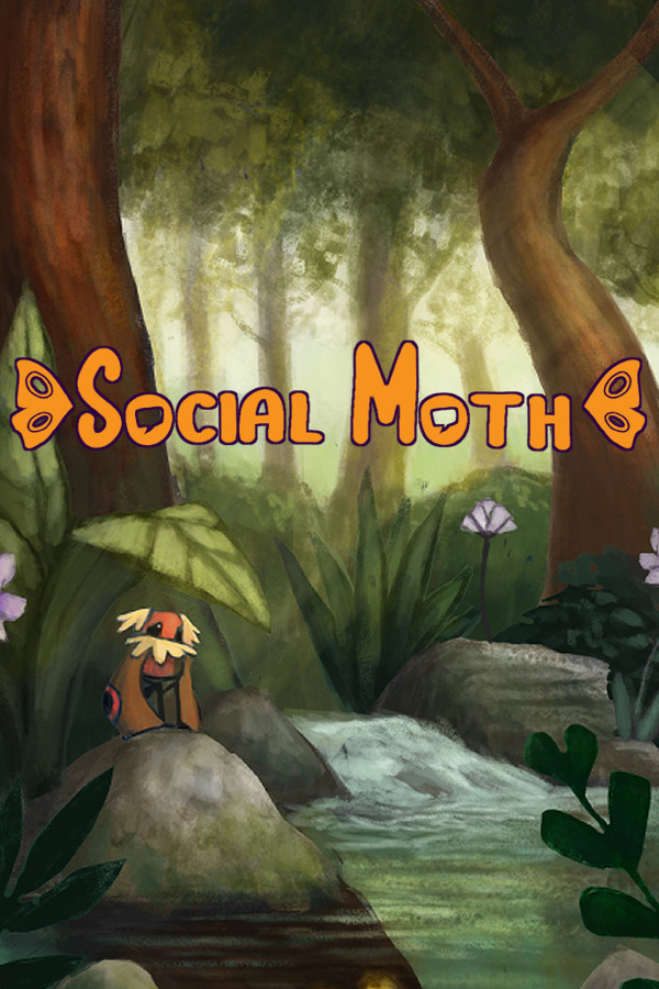
Social Moth is a charmingly beautiful narrative platformer where you play as Aletris, a socially anxious moth trying to find their place in a daunting world. Navigate conversations, solve creative puzzles, and enjoy satisfying platforming as you help Aletris contend with their social anxiety!
Team
Me
UI/UX, Concept Artist
Ben Heid
Director
Timothy Lim
Art Lead
Annabell Liao
Producer
Ryan Houghtaling
Engineering Lead
Catherine Su
Narrative Lead
Jeremy Cown
Audio & Marketing Lead
Xinyun Huang
Usability Lead
Steven Wu
Usability Lead
60+ members, 8 teams
Tools
Photoshop
Clip Studio Paint
Unity Engine
Skills
UI Design
UI Wireframes
Character Concepts
Trailer
Released May 11th, 2022
Social Moth is a charming narrative platformer where you play as Aletris, a socially anxious moth trying to find their place in a daunting world. Navigate conversations, solve creative puzzles, and enjoy satisfying platforming as you help Aletris contend with their social anxiety.
The Task
Extra Polish
Diving into Social Moth, I mainly worked on stylizing the UI to fix within the rest of our game's style. The game itself already had a working flow and assets, but the in-game art style changed to be much more hand drawn. So I reiterated existing systems and conceptualized screens.
Problem(s)
- Top left Anxiety Bar didn't feel very impactful. Many users struggled realizing what the bar is/does.
- No screen to be able to see gifts the NPCs give players.
- UI felt unpolished and did not match the game's aesthetic.
Task(s)
- Work with artists and art leads to make Anxiety Bar more visually impactful.
- Create concepts for a HUD that shows off all the NPCs' gifts, keeping in mind of real life anxiety coping mechanisms.
- Overhaul UI to better align with the hard drawn style the rest of the game has.


References
Simple, & Subtle
In-game we have a much more hand drawn style that thrives on not having perfect lines. So we want to push that art style even further with our UI while also not taking too much attention away from the game's environment.
- Don’t focus on symmetry or perfection. Imperfection shines positively with hand drawn.
- Textured pencil brushes rather than pen tool or vectors.
- Lineless colour blocks and let the shape language speak for itself unless absolutely necessary for extra details.
- Low frame animation to give UI movement so it doesn't feel overly static.

Iterations
Sketches
One of the biggest focus was creating a "Sensory Kit" or basically a soothing kit that is quite known to help those with anxiety or general worry. Outside of concepts there were certain things to consider.
- Sensory kits are not entirely well known, how should we portray it? Do we treat it as some kind of collectible? Should there be more meaning to it to those who are aware what it is?
- How can we expand on the sensory kit? Should we have hover tooltips that further explains the gift given by the NPC?
The other areas I focused on was making iterations for the dialogue and choice HUDs and how to stylize the rest of the screens like main menu and settings.
- Wanted to make a hover state that match the main motifs of the game: moths, narrative, and eyes.
- While I want the over UI to be on the simple side I want decoration to give the menu a sense of life. Like an eye with low frame animation looking at the button or moth winds flapping at the sides.
- Concepted a Save/Load screen, figuring out to best way to display information that is relevant to the player like collectibles, location, and time.
- Taking into account that when players want to overwrite the save a pop-up will come up asking if they really want to overwrite the save.
- Tried to show different format for dialogue choices. Not only that but also think of ways of how to let the player know which choice either increased anxiety or lower anxiety.
- Floating bubbles that players can either click on or press the hotkey to choose. This is closer to Night in the Woods where they show a general idea of the choice rather than word for word.
- Common list format that allow players to get a better since of what they're picking.


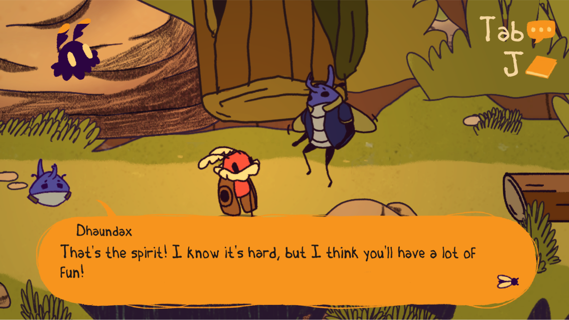
For the dialogue itself I wanted to make sure the players know exactly who is speaking. Though the old UI did do that the portrait is in an awkward position where players will not immediately see who it is.
- Distinguish characters talking and Moth's thoughts to themselves using a pointed tail versus a more cloud-like tail.
- Use a fly button to determine when players can click to continue.
- A concept similar to Night in the Woods where it will come from the character, then stack upon each other.
- Stylize what we have now with the dialogue bubbles between at the bottom part of the screen.
- Have the dialogue tail point at the characters, but that is a bit extra work to determine distance and position of the character.
- Portrait in the dialogue to save space though that might not be a needed worry. It also loses a sense of style with the dialogue tails.
- Have character headshot portraits be at the left top corner of the dialogue box with the tail pointed at them.
design system
Style Guide
The game already has a well established colour palette and fonts before I hopping into doing UI/UX. I mostly helped establish rules to the style guide like when and where to use to use the fonts and what percetange to use the colours throughout the UI.
Though for the colours, I wanted to make sure it would pop out especially with how colourful the game is in general. So while keeping the orange-yellow I wanted boost their saturation up while also using an off-black shade as our shading also does not use black.

Polish
Final
Since the UI style in general is quite simple and flat going from sketches to final assets was straight forward with not much more needed to change afterwards.
- Working with engineers, when Anixety is high the screen will darken to lessen the player's vision to give a sense of anxiety to them.
- Aletris' thought bubble is now a lighter yellow as players were saying the shape language isn't enough of a distinction.
- All UI elements but buttons have low framerate animation similar to the environment.



The End
Ending Thoughts
Social Moth was me dipping my toes into UI/UX—more so UI Art—where I found myself enjoying the process of questioning what-ifs and figuring out ways to communicate with the player. Working on this project made me realize a lot of what I enjoy from game development and what I ended up not enjoying. A true eye opener.
Ever since I took a class on UI/UX I really wanted to experience what it was like in an actual project. I'm really glad this was my first "introduction" to the process. Though it wasn't perfect, I was able to start realizing what kind of questions what I needed to ask or what to tackle certain problems. Even more that this is where I learned UI/UX is not an isolated department but instead works with almost any kind of department imaginable. It just depends what kind of question is being asked.
Because this project is a AGP cornerstone that has a relatively strict timeline there was a lot of times where UI/UX would get pushed back. In addition to the fact that there was no discussion on revamping or questions being asked until the later half of the game development. This caused a lot of issues where while it seemed like there was a lot of time for us to implement things, the ideation part would take too long leaving little time to truly polish and smoothen the experience.

Start


00
:
00
AM