The Wind and The Wisp was the first thesis project I worked on where I started from a nearly blank slate. While it did have a bare bones calibration sequence, anything beyond that, it was unsure how much other UI/UX work the game needed entirely. As game development continued, obvious problems were starting to pop up, especially on how to communicate the alternative controller, the microphone. Through the process I will have to figure out how to communicate to players the distinction of characters: Wisp (keyboard) and Wind (microphone).
Players do not have a proper onboarding for microphone, and overall game mechanics.
Lack of iconography to show if microphone is being detected and when to blow into the microphone.
Utilize Wind as a character and mechanic that feels impactful, but not tiring or repetitive.
Create user flow for microphone calibration and work with game designer to create tutorial.
Design cohesive, understandable HUD for microphone detection and different flower mechanics.
As the game is following the footsteps of visually pleasing narrative games like Gris, Neva, and Abzu I wanted to keep the aesthetics of the UI relatively simple. We don't want the UI to take away from the game but still communicate to the player effectively.
Simple fonts. Avoid serif at all costs.
Assets should not be overly decorative, leaning towards more simple shapes other than flower motifs.
Flat colours. No gradient. No drop shadow.
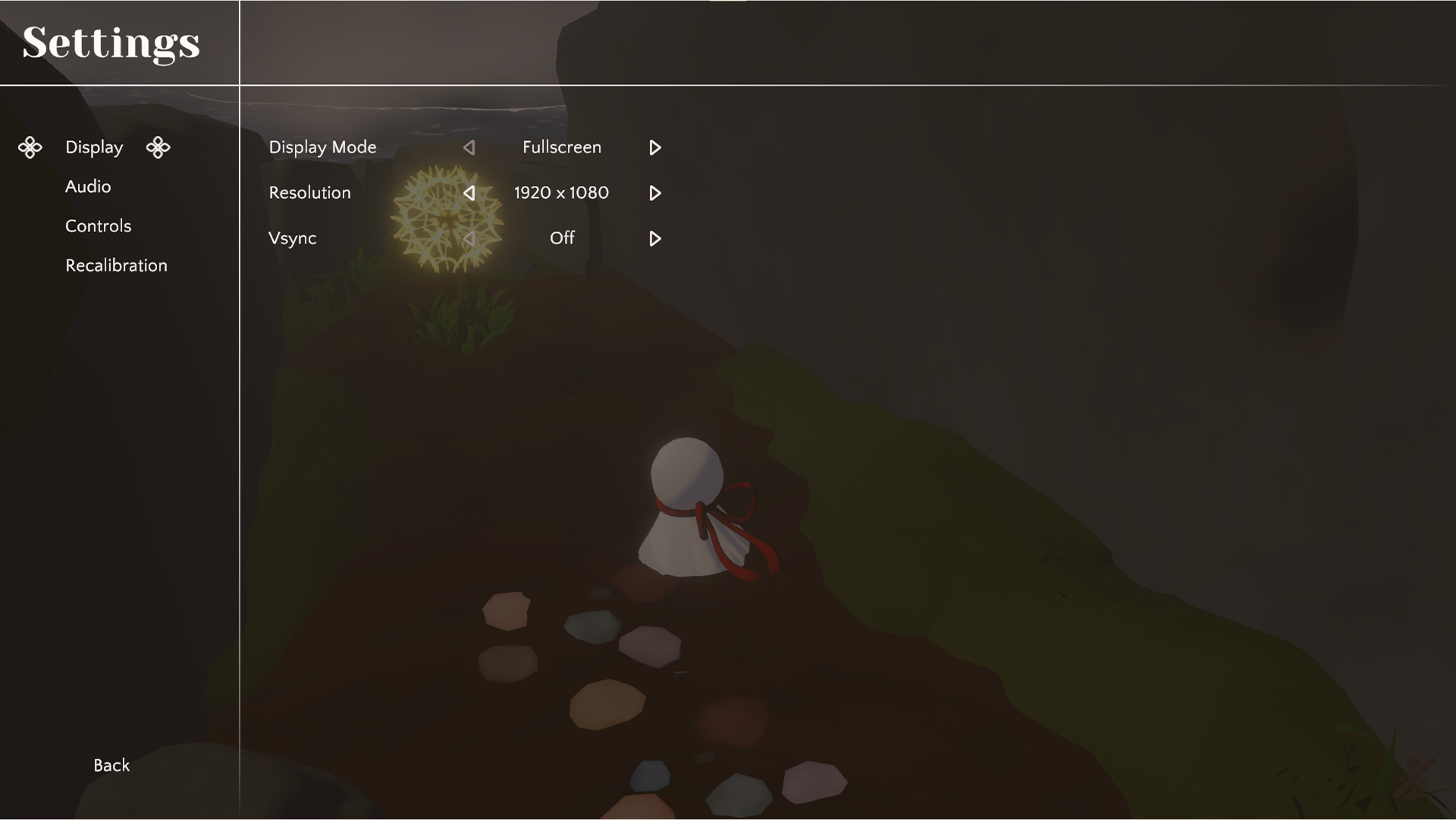
During this time of development, I was figuring out how to display screens like the main menu, and settings. I really wanted to make sure even with these more common screens that players are naturally able to navigate through the menus with no confusion. The settings was especially more important as we want to incorporate a Recalibration sequence that allow players to recalibration their microphone at any time.
The toughest part was really the calibration sequence and in-game tutorial. As at this time, we wanted to experiment how players react to the narrative heavy story/dialogue.
Due to locally saving data, we used Before Your Eyes as reference for calibration.
How do we separate character dialogue to tutorial dialogue? Is there a distinct way we can have the player realize the character dialogue is a separate character named Wind and not Wisp? Could we combine narrative with tutorial, making it feel more like a natural conversation?
For the style guide I wanted to stray away from pure black and white while keeping within the warmer colour temperatures. The more decorative parts of the UI, I decided to go for pinks to act as a derivative to Wisp's red ribbon.
As everything was becoming much more established, mocking up the hifis turned out to be a much smoother process. There were more decisions to cut and simplify rather than adding on top.
Other than tutorial tips, dialogue is removed as it was decided that the storytelling will be less concrete similar to Journey and Gris.
The "E" interaction button floating UI will only be an arrow far away, indicating that the object is interactable. As the player gets closer the "E" will fade in.
Calibration will be simplified and the large block paragraph was split into two.
One screen is the consent section, giving the players a choice to play with or without microphone. So even though we promote alt control, we allow those who do not have a microphone to play the game.
Microphone selection and the addition of Push to Talk toggle are in the second half.
Calibration fail state will give players option to restart calibration or going back to the screen where they can choose to play with or without the microphone.
Controls settings page simplified as players will not be able to customize keybinds.
Microphone settings originally under Controls gets shifted down to its own category allowing us to merge it with Recalibration and puts all microphone settings on one screen.
This project honestly has been quite the joy working on. I've always been quite fond of dialogue-less narrative games and how they utilize the game's environment to pull the player along. Because this game has an addition to being having an alt control, we had to think of ways to utilize tech art, VFX, and UI/UX to represent the player's action effecting the game's world.
During my time working on this game I have never harboured any regrets joining. Compared to other student projects I have worked on previously, this is one of the more interdisciplinary I've had the privilege of experiencing.
Typically within student projects many of the disciplines will not interact with each other, only there to gain experience from the project and if there are any issues it would be up to the producer or director to act as the middleman. In this team it was so easy to be able to ask questions, clarification, and share thoughts with no worries of anyone taking anything personal. Everyone wanted this game to succeed and just looking how we all interact with each other is an amazing example of that.
Though I wish to joyfully brag about our team culture, the beginning was definitely still in the more awkward stages. Within the earlier stages for UI/UX there were times where I was hesitant to become more involved working within Unity. I left the engineers to do what they did best while giving base notes of how the UI will function.
The me now realizes that was a bit of a mistake. As I have experience working with Unity UI it would have been more ideal for me to build the UI Canvas, creating all the necessary prefabs then talking more to the engineers involved in the making of the UI about functionality. Though the UI right now looks quite good there are definitely very nitpicky stuff about it I wish I brought up sooner so it would feel smoother and look even better than now.
I realized that UX design isn't just about the HUD players see it's about the entirety of the player experience within the game space. While, yes, it is large part of it UX all-in-all is a design role. There are much more things to considering if having UI does not solve the issue alone.
Taking what I've learned, I hope to continue to be able to tackle issues with different perspectives. I want to take UX design as something beyond just what the players see on their screen and to be immersive to their experience without having to second guess. I want players to explore with no hesitation whether that be the game itself or the HUD with ease.